So first things first, my name’s Helena. People and the world interest me hugely and I love to learn new stuff. But what it all comes down to is this:
I love organisation
I like things to look nice
We are so much more effective when things are organised in a useful way. Imagine if you kept your cutlery drawer in the bedroom. Aside from running the risk of scaring off potential lovers, it would make cooking dinner a needlessly time-consuming task. Of course, it would be more sensible to have your knives next to your chopping board.
There is no real value in knowing that some men’s index fingers are longer than their ring fingers, while for other men it is the other way round. However, research has recently shown that men whose ring fingers are longer than their index fingers are significantly more likely to develop prostate cancer (http://ow.ly/mLLWd). So by organising some information – and admittedly doing some stats wizardry – scientists may have come up with a quick and simple test for prostate cancer risk.
Ooh, life-saving.
I am also a believer in effective and pleasing presentation. I’m far more tempted to read (or wear, or eat, or buy…) something that is satisfying to my inner aesthete. If a report or an article is a forest of words with little blank space or interesting pictures upon which to rest my eye, then I (along with most people) am likely to switch off and start thinking about Game of Thrones or something. The author of the article might have had something game-changing to say, but it’s not much use if his or her readership has wandered off to straighten the wall-hangings.

People in Game of Thrones are nice to look at (from meltystyle.fr)
Consider this… The human brain is hard-wired to quickly make sense of certain visual characteristics, and it can interpret trends and patterns in information more easily if it’s presented in a way that takes advantage of what are known as ‘pre-attentive attributes’ (http://ow.ly/mLQCY). You can do this by using things like colour, bold lines, changes in hue and intensity, height, groupings (blah, blah) to your advantage. Anyway, enough. I’ll talk about this in more detail at a later date.
What is my point? If you want your message to be understood, and to have real impact and influence, it is vital that you present your information in a clear, attractive and engaging way.
Here is a fabulous example of how a clear message has been communicated through clever yet simple use of data visualisation. I’d even go so far as to say that it’s also a great example of a ‘sticky idea’; i.e. one which is easily understood and remembered, has high impact, and can be quickly shared. I originally came across this picture on Facebook, but I’ve seen it in countless other places as well. I’m not going to bother explaining it to you, because I think it speaks for itself:
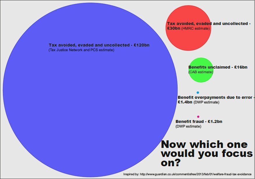
Taken from twicsy.com
When I was doing a bit of research, I discovered a movement called Informatism (http://ow.ly/mLSH9). Now this sounds like it might all be very complicated, but put simply, it’s about the art of information. A number of websites I’ve looked at launch straight into computer terminology and techie bunf which I think can be horribly off-putting. I also think that this approach misses the point. Of course there will be an electronic and ‘big data’ component to some of what I’ll be writing about, but this is not the focus of my blog. I’m more interested in the creative elements and practical applications of data visualisation tools. Or in other words, organising stuff and making it look pretty.
There are a couple of beautiful books out there that illustrate (geddit?!*) this perfectly. In particular I like Data Flow: Visualising Information in Graphic Design, but sadly when I saw it in a bookshop and learned how much it costs I had to content myself with stroking it and then putting it back on the bookshelf (http://ow.ly/mLTaH).
The most important thing about my blog is that it shouldn’t be viewed as something that only certain people can understand. I believe that everyone can benefit from learning about the beauty and application of data visualisation. In my next instalment I’ll be coming to the end of my introductory set of posts, and going into a little more detail about what this blog will deliver and how it can add value within a number of areas of our lives. I’ll also be telling you about the strengths and skills I’ll be bringing to the story, including why it’s such a fantastic thing that I’m not a mathematician!
See you all very soon 🙂
*sigh.

Recent Comments